Exploring the Relationship between Religion and Demographics in R
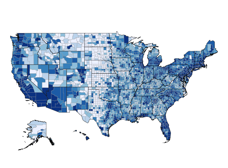
Today’s guest post is our second by Julia Silge. In her first post (“Mapping US Religion Adherence by County in R“) she demonstrated how to work with US religion adherence data in R. In this post she explores the relationship between that dataset and US Demographic data. Julia can be found blogging here or on Twitter.
I started exploring the ASARB religion census in my previous guest post here on Ari’s blog; now in today’s conclusion on this topic, let’s see how we can combine a data set like this one with demographic data to gain context and a deeper understanding.
Just as a reminder, the Association of Statisticians of American Religious Bodies (ASARB) publishes data on the number of congregations and adherents for religious groups for each county in the United States and the original data file for the survey is available here. The file at the Association of Religion Data Archives is an SPSS file so we need to use the foreign library to access the file.
library(foreign)
counties <- read.spss("./ReligiousMembershipCounties2010.SAV",
                      to.data.frame = TRUE)
There are so many directions we could go from here with this data set; let’s zoom in and look at the state where I grew up, Texas. It will be a nice example because it is a large state with lots of counties and a pretty diverse population. Let’s start with the total religious adherence, so we have an idea of the big picture.
library(choroplethr)
library(ggplot2)
library(viridis)
counties$region <- counties$FIPS
counties$value <- counties$TOTRATE
counties[(counties$value > 1000),'value'] <- 1000.
choro = CountyChoropleth$new(counties)
choro$title = "Total Religious Adherents by County"
choro$set_num_colors(1)
choro$set_zoom("texas")
choro$ggplot_polygon = geom_polygon(aes(fill = value), color = NA)
choro$ggplot_scale = scale_fill_gradientn(name = "Adherence rate\n(per 1000 population)", colours = viridis(32))
choro$render()
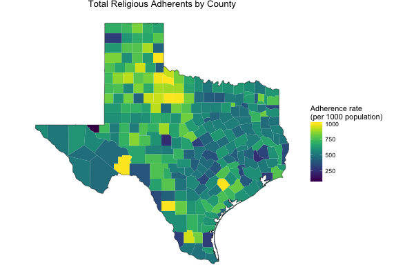
Texas has high to moderate rates of religious adherence through many of its counties. What are the distribution of Evangelical Protestants and Mainline Protestants?
library(gridExtra)
counties[is.na(counties)] <- 0
counties$value <- counties$EVANRATE
choro1 = CountyChoropleth$new(counties)
choro1$set_zoom("texas")
choro1$title = "Evangelical Protestants by County"
choro1$set_num_colors(1)
choro1$ggplot_polygon = geom_polygon(aes(fill = value), color = NA)
choro1$ggplot_scale = scale_fill_gradientn(name = "Adherence rate\n(per 1000 population)", colours = viridis(32))
counties$value <- counties$MPRTRATE
choro2 = CountyChoropleth$new(counties)
choro2$set_zoom("texas")
choro2$title = "Mainline Protestants by County"
choro2$set_num_colors(1)
choro2$ggplot_polygon = geom_polygon(aes(fill = value), color = NA)
choro2$ggplot_scale = scale_fill_gradientn(name = "Adherence rate\n(per 1000 population)", colours = viridis(32))
grid.arrange(choro1$render(), choro2$render(), ncol = 2)
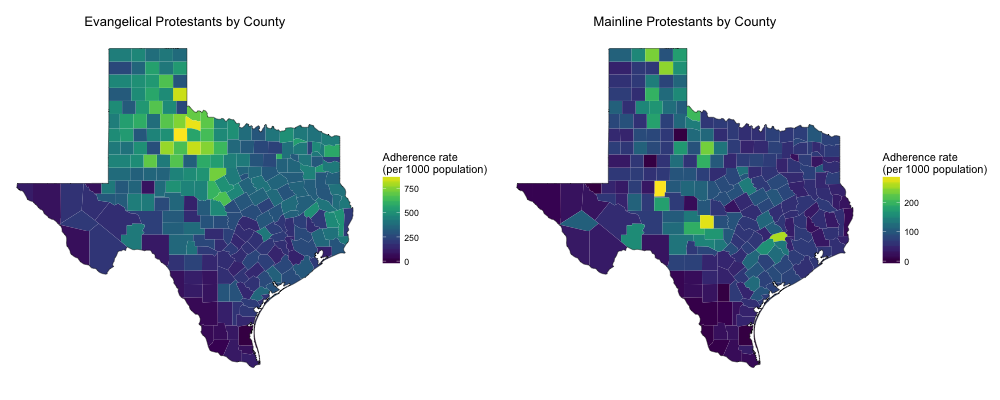
There are many more Evangelical than Mainline Protestants in Texas, and both are distributed somewhat differently than the total religious adherents as a whole. What about Black Protestant denominations?
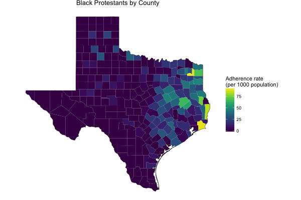
These numbers are lower, and also they are distributed very differently than the other Protestant denominations, all squished over by Louisiana. Let’s compare that to Texas’ black population by using the 2013 ACS county demographic data included in Ari’s choroplethr package.
data(df_county_demographics)
df_county_demographics$value <- df_county_demographics$percent_black
choro1 = CountyChoropleth$new(df_county_demographics)
choro1$set_zoom("texas")
choro1$title = "Texas' Black Population"
choro1$set_num_colors(1)
choro1$ggplot_polygon = geom_polygon(aes(fill = value), color = NA)
choro1$ggplot_scale = scale_fill_gradientn(name = "Percent population", colours = viridis(32))
counties$value <- counties$BPRTRATE
choro2 = CountyChoropleth$new(counties)
choro2$set_zoom("texas")
choro2$title = "Black Protestants by County"
choro2$set_num_colors(1)
choro2$ggplot_polygon = geom_polygon(aes(fill = value), color = NA)
choro2$ggplot_scale = scale_fill_gradientn(name = "Adherence rate\n(per 1000 population)", colours = viridis(32))
grid.arrange(choro1$render(), choro2$render(), ncol = 2)
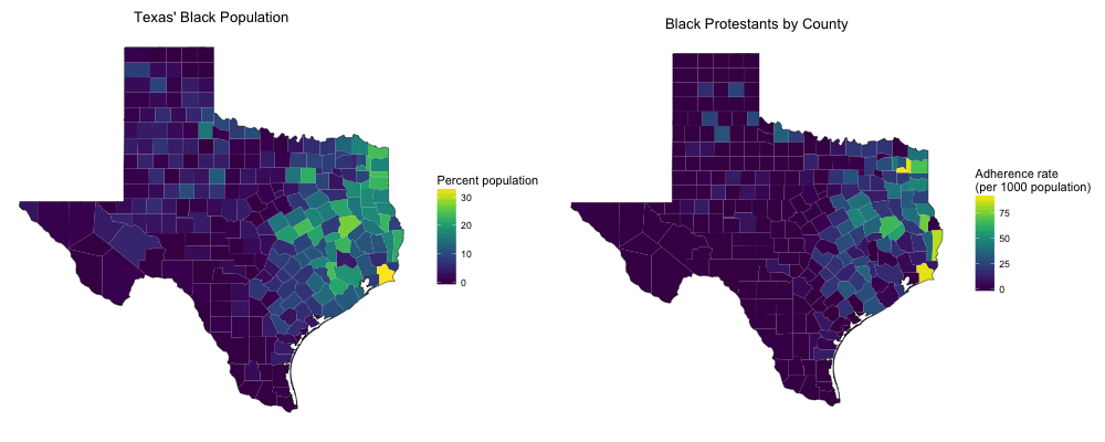
Yep, makes sense! Let’s see how strongly these two measurements are correlated. First we can join the religion data with the ACS data, and then we can calculate a correlation coefficient.
library(dplyr)
countiesjoin <- counties %>% filter(STABBR == "TX") %>%
        select(CNTYNAME, STABBR, FIPS, BPRTRATE) %>%
        left_join(df_county_demographics, by = c("FIPS" = "region"))
myCor <- cor.test(countiesjoin$BPRTRATE, countiesjoin$percent_black)
The correlation coefficient between the adherence rate for Black Protestant denominations and the percentage of the population that is black in Texas counties is 0.746 with a 95% confidence interval from 0.686 to 0.796.
Let’s look at one more category for the Texas population, Catholics.
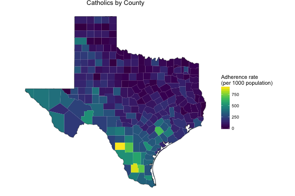
Ah, lots of Catholic Texans towards the Rio Grande valley. Let’s make one more map to see if these are the same counties with the highest Hispanic populations.
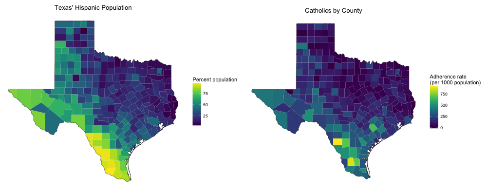
We can see noticeable similarities here as well. Let’s check out the correlation between these quantities.
countiesjoin <- counties %>% filter(STABBR == "TX") %>%
        select(CNTYNAME, STABBR, FIPS, CATHRATE) %>%
        left_join(df_county_demographics, by = c("FIPS" = "region"))
myCor <- cor.test(countiesjoin$CATHRATE, countiesjoin$percent_hispanic)
The correlation coefficient between the Catholic adherence rate and the percentage of the population that is Hispanic in Texas counties is 0.752 with a 95% confidence interval from 0.693 to 0.801. This correlation coefficient is about the same as the one for the black population and Black Protestant adherence rates.
These are just a few examples of the questions that can be explored with this rich, interesting data set. Combining it with supporting data such as the 2013 ACS demographic information can help us put this information into context. I’ve enjoyed learning a bit more about demographics as well as how to use choroplethr; I am happy to hear feedback and any questions!
The religion data were downloaded from the Association of Religion Data Archives, www.TheARDA.com, and were collected by Clifford Grammich, Kirk Hadaway, Richard Houseal, Dale E. Jones, Alexei Krindatch, Richie Stanley, and Richard H. Taylor.