Today’s guest post is by Julia Silge. After reading Julia’s analysis of religions in America (“This is the Place, Apparently“) I invited her to teach my readers how to map information about US Religious Adherence by County in R. Julia can be found blogging here or on Twitter.
I took Ari’s free email course for getting started with the choroplethr package last year, and I have so enjoyed making choropleth maps and using them to explore demographic data. Earlier this month, I posted a project on my blog exploring the religious demographics of my adopted home state of Utah that made heavy use of the choroplethr package and today I’m happy to share some of the details of the data set I used here on Ari’s blog and do some new analysis.
[content_upgrade cu_id=”2698″]Bonus: Download the code from this post![content_upgrade_button]Download[/content_upgrade_button][/content_upgrade]
The Association of Statisticians of American Religious Bodies (ASARB) publishes data on the number of congregations and adherents for religious groups for each county in the United States. The last large “religion census” they published was in 2010; they make some data exploration and visualization tools available here, the original data file available here, and the codebook available here.
The file made available at the Association of Religion Data Archives is an SPSS file so we’ll need to use the foreign library to access the file.
library(foreign)
counties <- read.spss("./ReligiousMembershipCounties2010.SAV",
                      to.data.frame = TRUE)
The data set includes hundreds of observations for each county in the United States, including number of adherents and rates of adherence for all the denominations (and non-denominational categories) they surveyed. Also included are some larger categories into which all the smaller religious groups are placed.
- Total adherents/adherence rates including all the religious groups
- Evangelical Protestant
- Black Protestant
- Mainline Protestant
- Catholic
- Orthodox
- Other
So for example, an African Methodist Episcopal Church in a certain county would be counted both in the African Methodist Episcopal Church category and the Black Protestant category for that county. My Mormon neighbors would be counted in the LDS category and the Other category for my county here in Utah.
Now let’s make a map!
library(choroplethr)
library(ggplot2)
library(viridis)
counties <- counties[!is.na(counties$TOTRATE),]
counties$region <- counties$FIPS
counties$value <- counties$TOTRATE
counties[(counties$value > 1000),'value'] <- 1000.
choro = CountyChoropleth$new(counties)
choro$title = "Total Religious Adherents by County"
choro$set_num_colors(1)
choro$ggplot_polygon = geom_polygon(aes(fill = value), color = NA)
choro$ggplot_scale = scale_fill_gradientn(name = "Adherence rate\n(per 1000 population)", colours = viridis(32), limits = c(0, 1000))
choro$render()
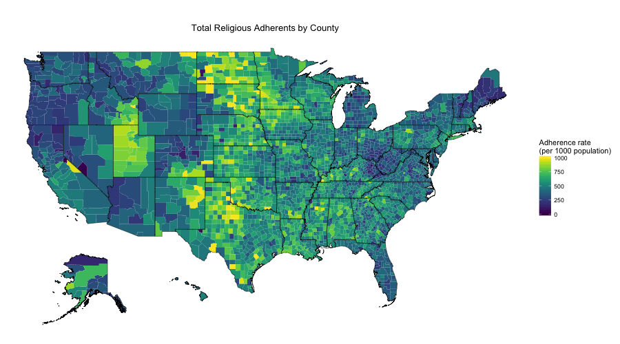
There are some differences visible here between the coasts and flyover country; religious adherence is higher in the center of the country than on either coast. My adopted home state of Utah has some of the highest religious adherence rates, perhaps to no one’s surprise. As you look at this map, you may be wondering about the inverse of this measurement, people who are not adherents of any religion. What would it mean to take 1000 and subtract these numbers? The ASARB is clear that they have not directly measured atheism or agnosticism in the U.S. population. They surveyed religious groups and did as thorough a census as they could manage; they did not survey the population and ask about religious beliefs. However, the numbers here must give us some kind of estimate of the religiously affiliated vs. unaffiliated.
I have used the viridis colormap here and for the rest of this blog post; it’s a new-ish colormap designed for Matplotlib last year by Nathaniel Smith and Stéfan van der Walt. It’s designed to be perceptually uniform, both when viewed in color and in black and white, and to be perceived well by readers with common forms of color blindness. And it’s so pretty! I am a fan. You can read more about its implementation in R here.
Notice that before I made the map, I assigned the adherence rate value to 1000 for counties that had values above 1000. There were a handful of counties in the data set that had total adherence rates (measured per 1000 population) above 1000. Yes, you read that right; somehow more people were going to church in that county than lived in that county. It was not many of the counties (29 counties, less than 1% of the total counties) and they were almost all rural, low-population counties, most with populations of just a few thousand people. What could be going on here? It’s possible that people are driving out of their own county to a neighboring county to go to church; this seems especially plausible in a very rural part of the country. It’s possible that people are getting double-counted at multiple religious bodies. The ARDA addresses this discrepancy in their discussion and attributes it to similar reasons: U.S. Census undercount, church membership overcount, and county of residence differing from county of congregational membership. I don’t think this discrepancy has a large effect on the maps and inferences we can draw from this data set, but it is good to keep in mind, especially as it relates to the uncertainty in measuring these adherence rates in counties with low populations. I did the substitution above in order to keep the scale of the map sensible.
There are many interesting questions we could ask with a data set like this. With the Iowa caucuses coming up in a matter of days on February 1, let’s take a look at Iowa. There has been a great deal of chatter recently about the importance of evangelical voters in the Iowa Republication campaign, so let’s examine religious adherence in this state. To start with, what is the total religious adherence in Iowa?
choro = CountyChoropleth$new(counties)
choro$title = "Total Religious Adherents in Iowa"
choro$set_num_colors(1)
choro$set_zoom("iowa")
choro$ggplot_polygon = geom_polygon(aes(fill = value), color = NA)
choro$ggplot_scale = scale_fill_gradientn(name = "Adherence rate\n(per 1000 population)", colours = viridis(32))
choro$render()
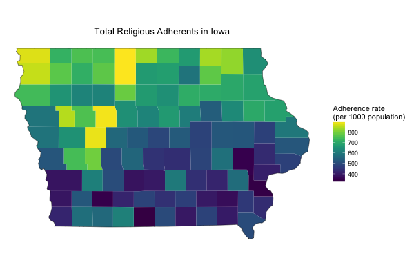
The total religious adherence rate looks pretty high, although there are differences from north to south. Looking at the United States map above, Iowa looks fairly typical compared to its neighbors in this regard. Let’s look now at the Evangelical Protestant adherence rate.
counties$value <- counties$EVANRATE
choro = CountyChoropleth$new(counties)
choro$title = "Evangelical Protestants in Iowa"
choro$set_num_colors(1)
choro$set_zoom("iowa")
choro$ggplot_polygon = geom_polygon(aes(fill = value), color = NA)
choro$ggplot_scale = scale_fill_gradientn(name = "Adherence rate\n(per 1000 population)", colours = viridis(32))
choro$render()
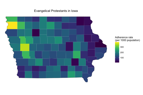
Well, that is much lower; evangelicals in Iowa are not a high proportion of people with religious affiliation. Who are the people who make up most of the religiously affiliated in Iowa?
library(gridExtra)
counties[is.na(counties)] <- 0
counties$value <- counties$MPRTRATE
choro1 = CountyChoropleth$new(counties)
choro1$set_zoom("iowa")
choro1$title = "Mainline Protestants in Iowa"
choro1$set_num_colors(1)
choro1$ggplot_polygon = geom_polygon(aes(fill = value), color = NA)
choro1$ggplot_scale = scale_fill_gradientn(name = "Adherence rate\n(per 1000 population)", colours = viridis(32))
counties$value <- counties$CATHRATE
choro2 = CountyChoropleth$new(counties)
choro2$set_zoom("iowa")
choro2$title = "Catholics in Iowa"
choro2$set_num_colors(1)
choro2$ggplot_polygon = geom_polygon(aes(fill = value), color = NA)
choro2$ggplot_scale = scale_fill_gradientn(name = "Adherence rate\n(per 1000 population)", colours = viridis(32))
grid.arrange(choro1$render(), choro2$render(), ncol = 2)
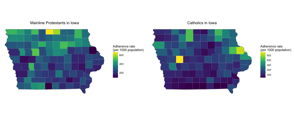
There are more Mainline Protestants and Catholics in Iowa than Evangelical Protestants. Perhaps people with these religious affiliations are less likely to vote Republican, or at least to vote in the Republican caucus. We certainly have not heard news reports about candidates courting these types of voters.
Is Iowa’s proportion of Evangelical Protestants different from its neighbors?
counties$value <- counties$EVANRATE
choro = CountyChoropleth$new(counties)
choro$title = "Evangelical Protestants in Iowa and Neighbors"
choro$set_num_colors(1)
choro$set_zoom(c("iowa", "missouri", "illinois", "wisconsin", "minnesota",
                 "south dakota", "nebraska", "kansas"))
choro$ggplot_polygon = geom_polygon(aes(fill = value), color = NA)
choro$ggplot_scale = scale_fill_gradientn(name = "Adherence rate\n(per 1000 population)", colours = viridis(32))
choro$render()
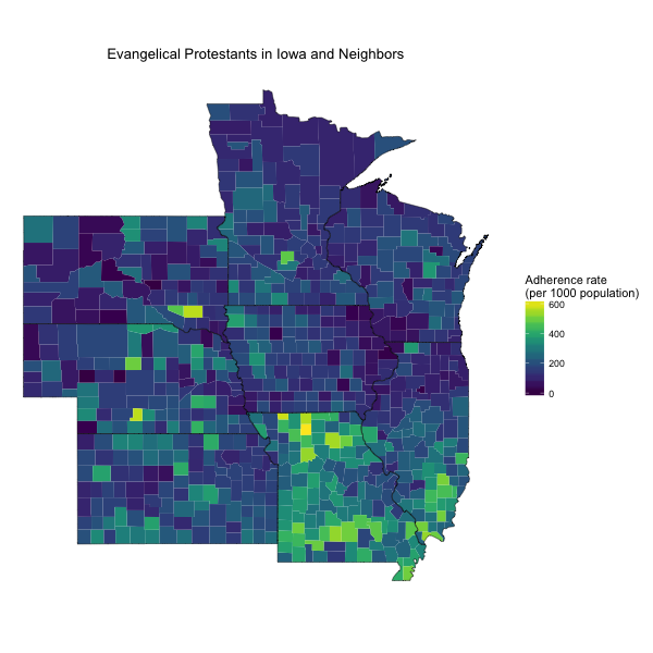
Iowa looks typical compared to most of its neighbors in its Evangelical Protestant adherence rate, and lower than its neighbors to the south such as Missouri and Illinois.
Evangelicals in Iowa are not particularly numerous within the state or compared to surrounding states, but the circumstances of Iowa’s early caucus and the political persuasions of this religious group have combined to make them important on the national stage.
There is a great deal more that could be explored with this open data set from the ASARB. In a second post, I’ll combine this religious adherence data set with the 2013 ACS demographic data to put some of this information in context. I am happy to hear feedback or answer any questions!
[content_upgrade cu_id=”2698″]Bonus: Download the code from this post![content_upgrade_button]Download[/content_upgrade_button][/content_upgrade]
The religion data were downloaded from the Association of Religion Data Archives, www.TheARDA.com, and were collected by Clifford Grammich, Kirk Hadaway, Richard Houseal, Dale E. Jones, Alexei Krindatch, Richie Stanley, and Richard H. Taylor.