Choroplethr v3.6.1 is now on CRAN
Choroplethr version 3.6.1 is now on CRAN. This version makes it easier to
- Calculate the percent change in demographic datasets
- Visualize that percent change on a map
As an example, the following map shows how the median age in US States changed between 2010 and 2015:
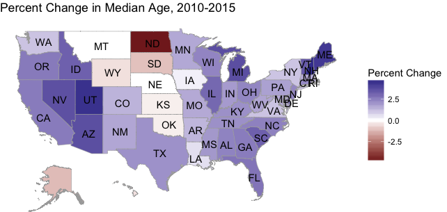
In the above map, both the extreme positive and negative values stand out.
To get this version, simply type the following from an R console:
install.packages("choroplethr")
packageVersion("choroplethr")
[1] ‘3.6.1’
New Data
To facilitate demonstrating this functionality I added two new datasets to choroplethr: df_state_age_2010 and df_state_age_2015. You can load them as follows:
library(choroplethr)

data(df_state_age_2010)
data(df_state_age_2015)
You can inspect and map each dataset like this:
head(df_state_age_2010)
region value
1 alabama 37.5
2 alaska 33.8
3 arizona 35.5
4 arkansas 37.2
5 california 34.9
6 colorado 35.8

state_choropleth(df_state_age_2010, title="2010 Median Age Estimates")

New Function: calculate_percent_change
To facilitate calculating the percent change between two “choroplethr-style” dataframes I created the function calculate_percent_change.
This function assumes that it is given two dataframes, each with a column called region and value. The dataframes are joined by the region column, and the percent change between their value columns is computed. The result is rounded to two decimal places.
calculate_percent_change itself returns a dataframe with region and value columns. This makes the result easy to map with choroplethr functions.
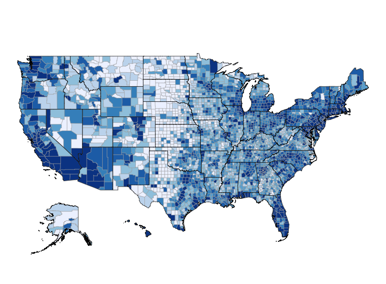
df_age_diff = calculate_percent_change(df_state_age_2010, df_state_age_2015)

head(df_age_diff)
region value.x value.y value
1 alabama 37.5 38.4 2.40
2 alaska 33.8 33.4 -1.18
3 arizona 35.5 36.8 3.66
4 arkansas 37.2 37.7 1.34
5 california 34.9 35.8 2.58
6 colorado 35.8 36.3 1.40

state_choropleth(df_age_diff, title="Percent Change in Median Age, 2010-2015")

New Visualization Option: Divergent Scale
The above map is not as informative as it could be, because the negative values don’t stand out very much. It’s also not clear which regions are near 0 or near -5%.
Choroplethr 3.6.1 solves this problem by letting uses select a divergent scale. To do this, simply set the parameter num_colors = 0.
state_choropleth(df_age_diff,
title = "Percent Change in Median Age, 2010-2015",
legend = "Percent Change",
num_colors = 0)
With the divergent scale, it’s clear where both the negative and positive outliers are.
Closing Notes
It has always been possible to use a divergent scale via choroplethr’s object-oriented system. Functions like state_choropleth exist to hide those details. That, in turn, allows beginners to create maps with minimal work. Adding support for divergent scales with the num_colors parameter is another step in that direction.
The only drawback is that the num_colors parameter is now overloaded:
- num_colors=0 will use a divergent scale. As we’ve seen above, this is useful when the values are both positive and negative.
- num_colors=1 will use a continuous scale. This is useful for detecting outliers.
- Setting num_colors to values in [2, 7] will use that many quantiles. This is a useful catch-all for detecting patterns within the data.
At some point it might make sense for me to rethink choroplethr’s API for setting scales. But at this point I wanted to add the new functionality without breaking any existing code.
[content_upgrade cu_id=”5640″]Bonus: Download the code in this post![content_upgrade_button]Click Here[/content_upgrade_button][/content_upgrade]