25 comments
Not sure if there is a requirement to include source code; here is an RMarkdown document showing a map of proposed zoning in Cambridge, Mass: http://rpubs.com/kent37/Camb_Light
Thank you and congratulations on being the first entry! Yes, it would be great if you could include source code. A big motivator for the contest is to help people learn from the submissions.
I updated it to use flexdashboard with a source link in the header bar. The layout is not quite as nice but there is source 🙂
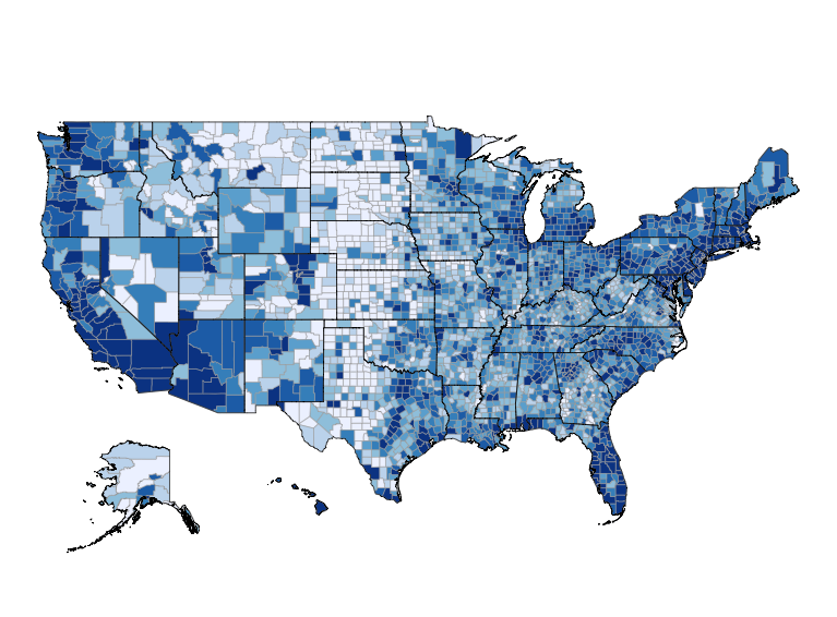
Long term view of tornado risk in the United States. http://rpubs.com/jelsner/TornadoRisk_longTermView
Fascinating topic!
Hi,
I’m a newbie in R and i’m interested in making/using chloropeth maps and GIS. I was in a conference yesterday sponsored by USAID and because our country is one of the most likely places to be affected by climate change and rapid urban development, i’d like to learn more. Can i stick around and see the works submitted and if you can recommend the best way for me to start learning. Thanks
Sure. As a starting point, I recommend taking my free course: Learn to Map Census Data in R.
Here is my answer to this contest. I have hosted it at github at the following location:
https://github.com/rlpowelljr/spatial-analysis-in-r/blob/master/Airport_Analysis.md
In this document, I look at the effect of airports on county unemployment rates.
Here is my entry:
https://github.com/rlpowelljr/spatial-analysis-in-r/blob/master/Airport_Analysis.md
I look at how the proximity of airports affects county unemployment rates.
The major components of my analysis are complete, so I’ll submit my entry now: analysing the 2016 Australian Federal Election (just completed) with a comparison between the results at each individual polling place and the eventual winner for that electorate shows how polarised each electorate is, and the finer-scale politics that get washed out by the overall result.
https://jcarroll.shinyapps.io/AUelection2016/
The shapefile involved is the electorate boundaries which I’ve merged with polling booth results to shade by overall winner, with individual polling places colored by which party had the most votes at that booth (only total votes across the electorate actually count). This is obviously skewed by how many people vote at each booth (only electorates are consistent in population count) so I’ve included the number of votes at each booth as a separate plot.
I’m still waiting for some data to be uploaded by the electoral commission (the counts are complete but not yet available) so I’ll continue to update the page with newer data. A blog post will follow (jcarroll.com.au) once it’s all ready. Source available via the flexdashboard link and will be copied over to GitHub shortly.
Here’s my entry: http://www.pct.bike/
And associated paper: http://arxiv.org/abs/1509.04425
Code: https://github.com/npct
Not sure whether this is eligible for the competition, but it might be of interest: https://rpubs.com/chrisbrunsdon/94923
My submission is here: http://personal.tcu.edu/kylewalker/spatial-neighbors-in-r.html
Code here: https://gist.github.com/walkerke/6915b02ac7f0c215bc2c75a687b3d269
Submission: http://rpubs.com/Tx_Rgr/198831
The purpose of the document is to analyze spatial point patterns using the Spatstat package and then convert the output into a shapefile for use in other programs (Spotfire, Tableau, etc).
Here’s how I’ve been playing with shapefiles recently: http://rpubs.com/utengr/198835
This is a recent project about Crimes in Greece during 2010 (the most recent available data). The whole project is available here : https://github.com/Maybach1988/Crimes_Visualization
The application also can be found directly here : https://maybach.shinyapps.io/Crimes_Visualization/
The shortest script in the contest? 😉
see: https://geoobserver.wordpress.com/2016/07/28/r-shapefile-a-short-script/
Maybe the shortest script in this contest. Short but effective. It is helpful for simply getting annoying tasks done. With just a few lines of code! It generates n thematic maps from n data columns from a shapefile into a PDF. Columns with not available values (NA) are sorted out. Code and data have to be in the same folder (here in „.“). The output-PDF is also generated in this folder. The example-data are from the OpenData-Server from the city Halle (http://www.daten.halle.de/). They were adjusted with QGIS. All columns with „*_t“ contain values as strings. Columns with „*_n“ contain numerical values. This points out differences in classifications.
The code should be adjusted and optimized on demand, e. g. by classifications. Code and data can be found at http://www.geoobserver.de/shape2pdf/shape2pdf.rar. Have fun testing it.
by Mike Elstermann alias geoObserver @mikee63
Great to learn from a compiled repository of work. My submission is on Delhi Spatial Crime Maps https://sociocartography.shinyapps.io/DelhiCrime/ and is built using R, Shiny and Leaflet.
Background
Delhi’s state of crime has translated into an unfortunate adage: Delhi is state of crime.
We learn from history and data that there is iterated pattern signals us deconstructing causes and so move from curative to preventive action.
Brief description of the submission:
Open source data from WorldPop and Night Light radiance (NASA) was conjoined with Crime Statistics by police stations.
The full map is a culmination of integrating micro satellite data and integrating it with event based data. Goe-coding police station in Delhi the features are overlayed through 5 layers. There is additional information on number of police personnel deployed and sanctioned per police station so juxtaposing it with crime incident and population density can help in quick and efficient disbursal. Delhi and India by and large follows overlapping system of administrative boundaries, therefore I have stuck to creating customized Vornoi (Voronoi diagram is a partitioning of a plane into regions based on distance to points in a specific subset of the plane) boundaries. In essence the spatial and event based (converted into spatial data) was integrated together by a uniform spatial resolution. The meta data was then rasterized and condensed into a rasterBrick which is used by the slider panel in Shiny.
nice work!
Here is my entry: https://github.com/fungyip/spatial_analysis_in_r
Hong Kong Population Center of Gravity (COG)
Here are my submissions:
1) Overview of ground-based rainfall measurement network data quality for Venezuela:
https://www.researchgate.net/publication/280098955_Calidad_de_datos_de_la_red_de_medicion_de_lluvia_para_Venezuela_Overview_of_ground-based_rainfall_measurement_network_data_quality_for_Venezuela?ev=prf_pub
2) Venezuelan rainfall dynamics: https://github.com/talassio/rain-dynamics/blob/master/pamphlet.pdf
Code: https://github.com/talassio/rain-dynamics
Both submissions where built using the vetools R package and shapefiles of Venezuela.
Here’s an analysis of all the parking tickets issued in Washington DC in April of this year:
https://github.com/Breza/DC_parking_violations
I demonstrate several ways of examining data from a shapefile, including simple visualization and more advanced analysis. All of my data and code are available on Github and my analysis is completely reproducible.
Here’s my submission: http://rpubs.com/danielequs/199150
Title: Marine Boundaries in R: Reading EEZ Shapefiles
Description: How to read ESRI shapefiles of the Exclusive Economic Zone (EEZ) in R, including visualization and a basic analytical application.
Hi Ari,
My submission can be found here: https://pracademic.shinyapps.io/LISA/
The code is in a GitHub repo here: https://github.com/rcatlord/shinyapps/tree/master/LISA
Thanks,
Henry