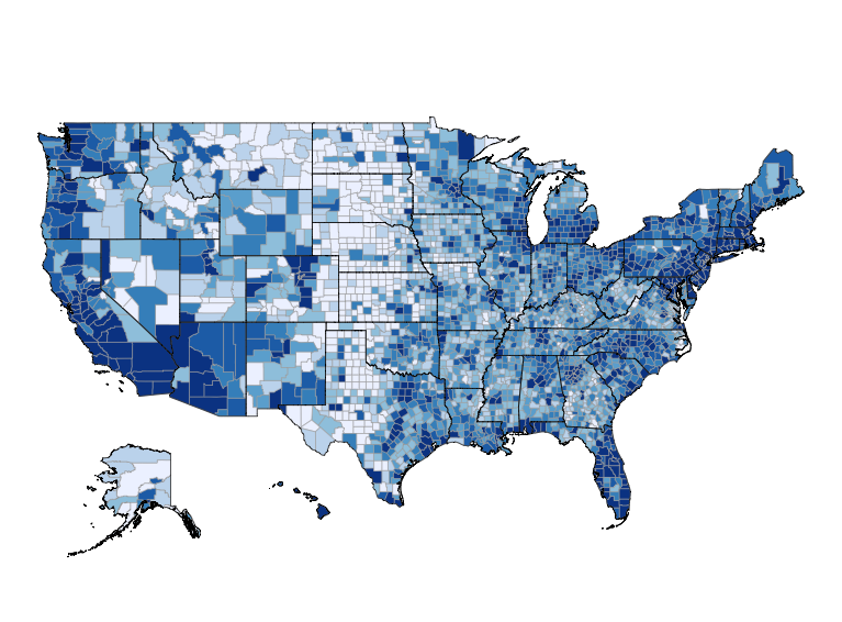
One interesting feature of Census data is that it can help us to better understand current events and claims by the media. For example, the news coverage of the shooting of Michael Brown in Ferguson, Missouri often reported that Ferguson is predominately black, while the police officers are predominately white. This video by PBS Newshour has a great discussion of the issue, starting at 4:30.
I know of no data source of police officer demographics, but choroplethr and choroplethrZip do ship with summary demographic statistics of each State, County and ZIP in the United States. As a demonstration of this technology I decided to explore the demographics of Ferguson, and compare it with the surrounding area.
It’s worth pointing out that while the news focused on two races (White and Black or African American), the US Census Bureau has a much more complex framework for Race and Ethnicity. Throughout this post I will use “White” to refer to what the Census calls “White not Hispanic” and “Black” or “African American” to refer to what the Census calls “Black or African American not Hispanic”. The data come from the 2012 American Community Survey (ACS) population estimates.
A final note is that my goal here is to demonstrate how free technology (namely the R programming language and its library of user contributed packages) allows anyone to dig deeper into US demographics. I will also show some of the challenges with doing this type of analysis. Lastly, I am not a professional demographer nor do I claim that this analysis is authoritative on the issue.
Initial Look
When doing an analysis of demographics the unit of geography is important. For example, according to Wikipedia Ferguson is a town that is simultaneously
- within the ZIP code of 63135
- within the County of St. Louis (FIPS code 29189)
- within the State of Missouri
As a first step, we can compare the demographics of each geographic unit above. Are the demographics of Ferguson’s ZIP different than that of its county or state? (Technical note: while Wikipedia lists Ferguson’s ZIP code as 63135, the Census Bureau provides data on Zip Code Tabulated Areas (ZCTAs), not ZIP Codes).
# first extract the state, county and zip values
library(choroplethr)
data(df_state_demographics)
state_values = df_state_demographics[df_state_demographics$region == "missouri", c("percent_white", "percent_black")]
data(df_county_demographics)
county_values = df_county_demographics[df_county_demographics$region == 29189, c("percent_white", "percent_black")]
library(choroplethrZip)
data(df_zip_demographics)
zip_values = df_zip_demographics[df_zip_demographics$region == "63135", c("percent_white", "percent_black")]
# now create a single data.frame for the values
df = data.frame(
region  = c("state", "state", "county", "county", "zip", "zip"),
  metric  = c("percent_white", "percent_black"),
  percent = c(state_values[1, "percent_white"],
              state_values[1, "percent_black"],
              county_values[1, "percent_white"],
              county_values[1, "percent_black"],
              zip_values[1, "percent_white"],
              zip_values[1, "percent_black"]))
# now plot
library(ggplot2)
ggplot(df, aes(region, percent, fill=metric)) +
  geom_bar(stat="identity", position="dodge") +
  ggtitle("Demographics of the State, County and ZCTA\n of Ferguson, Missouri")
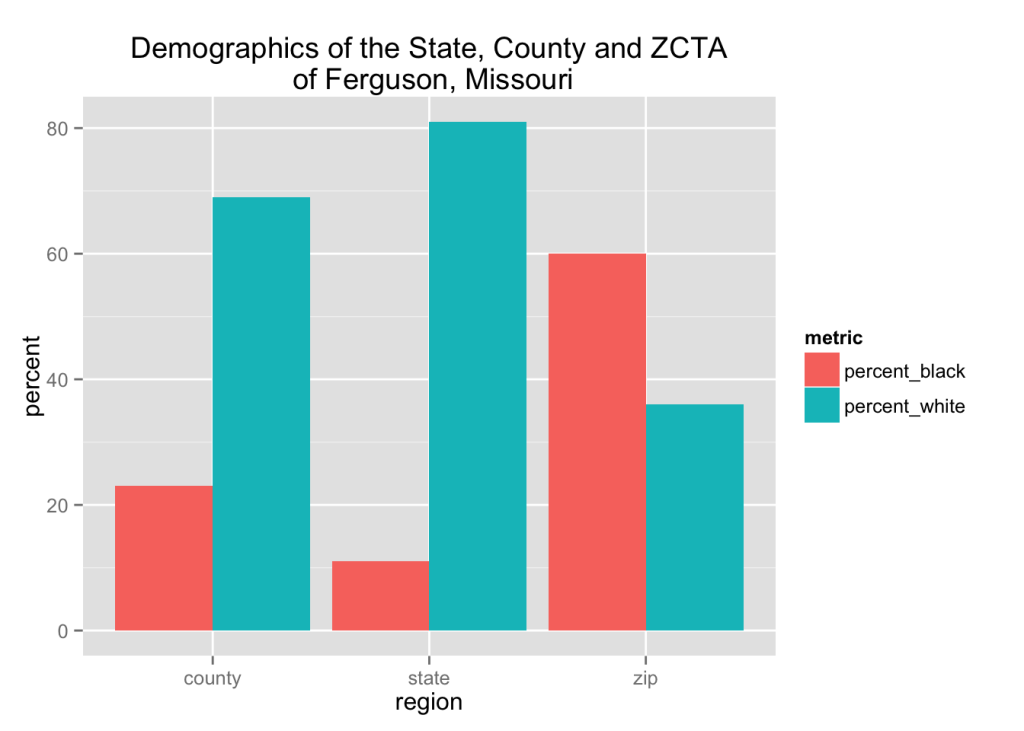
This bar chart shows that as we move from the largest geographic unit (State), to the smallest geographic unit (ZCTA), the percentage of residents who are Black or African American increases, and the percentage of residents who are White decreases.
Mapping by County
We can also create a choropleth map of these variables for the counties in Missouri.
# highlight a county
highlight_county = function(county_fips)
{
  library(choroplethrMaps)
  data(county.map, package="choroplethrMaps", envir=environment())
  df = county.map[county.map$region %in% county_fips, ]
  geom_polygon(data=df, aes(long, lat, group = group), color = "yellow", fill = NA, size = 1)
}
library(ggplot2) # for coord_map(), which adds a Mercator projection
data(df_county_demographics)
df_county_demographics$value = df_county_demographics$percent_white
choro_white = county_choropleth(df_county_demographics, state_zoom="missouri", num_colors=1) +
  highlight_county(29189) +
  ggtitle("Missouri Counties\n Percent White") +
  coord_map()
df_county_demographics$value = df_county_demographics$percent_black
choro_black = county_choropleth(df_county_demographics, state_zoom="missouri", num_colors=1) +
  highlight_county(29189) +
  ggtitle("Missouri Counties\n Percent Black") +
  coord_map()
library(gridExtra)
grid.arrange(choro_white, choro_black, ncol=2)
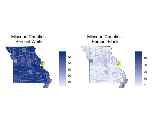
While St. Louis County does stand out as having slightly different demographics than its neighbors, something else stands out even more. Namely, the county directly east of St. Louis is an outlier. Interestingly, though, that county is not even a county at all: it is the independent city of St. Louis.
Metropolitan Statistical Area
The above maps highlight that Saint Louis is on the Eastern edge of Missouri. So we might want to compare the demographics of Ferguson with some of western Illinois as well. This is the central concept of Metropolitan Statistical Areas (MSA), and the Saint Louis Metropolitan Area does indeed span both states. The choroplethrZip package makes it easy to map of all ZCTAs in an MSA.
# highlight a zcta
highlight_zip = function(zip)
{
  library(choroplethrZip)
  data(zip.map)
  df = zip.map[zip.map$region %in% zip, ]
  geom_polygon(data=df, aes(long, lat, group=group), color="yellow", fill=NA, size=0.5)
}
df_zip_demographics$value = df_zip_demographics$percent_white
choro_white = zip_choropleth(df_zip_demographics, num_colors=1, msa_zoom="St. Louis, MO-IL") +
  highlight_zip("63135") +
  ggtitle("St. Louis MSA ZCTAs\n Percent White") +
  coord_map()
df_zip_demographics$value = df_zip_demographics$percent_black
choro_black = zip_choropleth(df_zip_demographics, num_colors=1, msa_zoom="St. Louis, MO-IL") +
  highlight_zip("63135") +
  ggtitle("St. Louis MSA ZCTAs\n Percent Black") +
  coord_map()
grid.arrange(choro_white, choro_black, ncol=2)
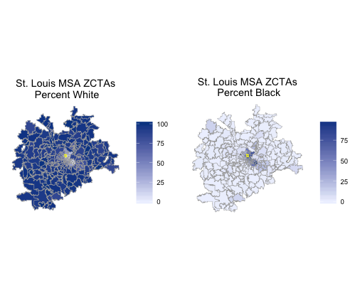
This above map implies that the St. Louis MSA is an example of geographical segregation. The African American population seems to cluster in the ZCTAs in the center of the city, and the White population seems to cluter in the ZCTAs outside the center of the city.